Marta Harding Designs
builds & grows brands
Vision Toolkit
Our team created the look and feel for the Prize’s design language along with the brand’s foundation. Explore the resources developed by OpenIDEO and SecondMuse here.


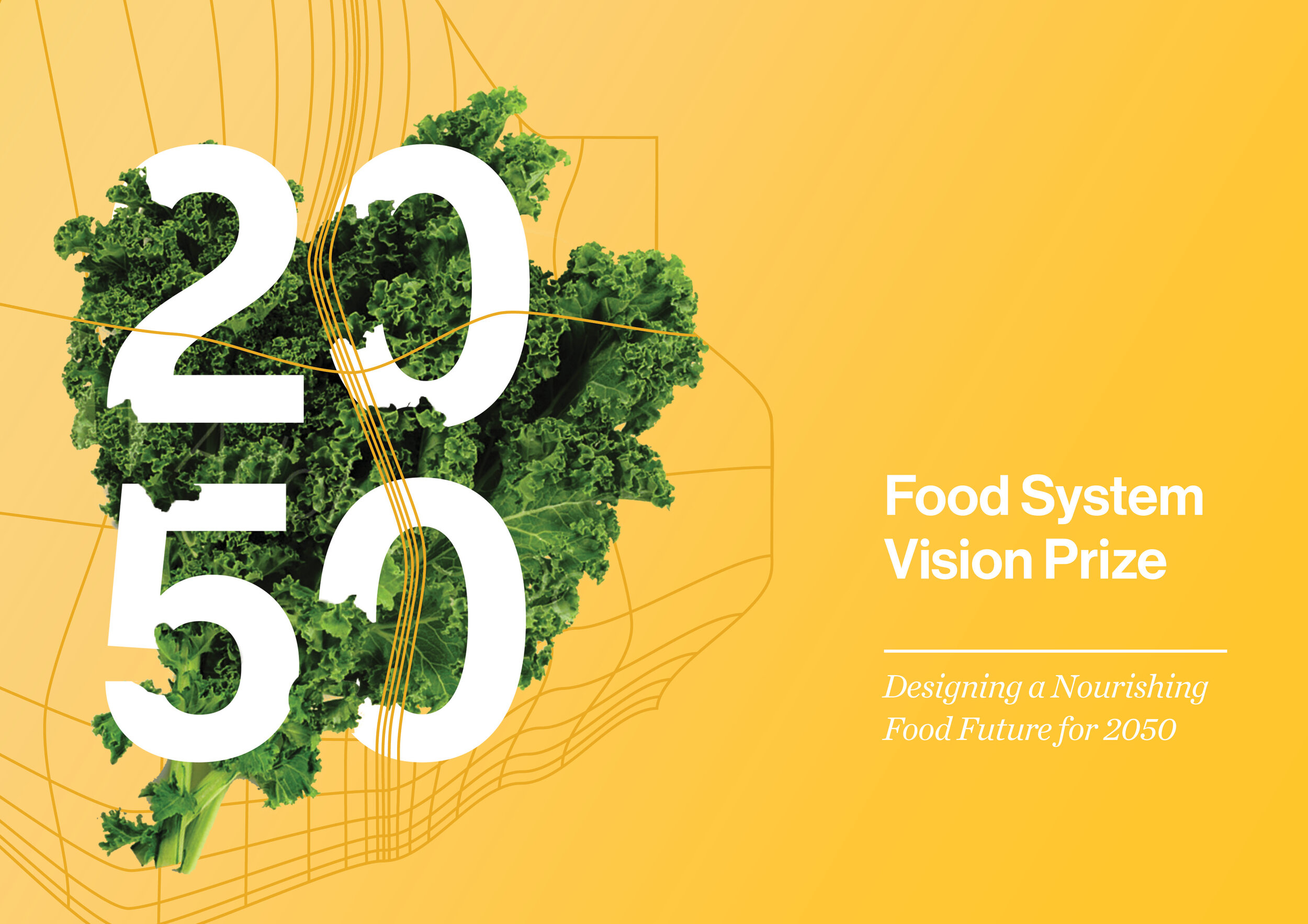
Prize Identity


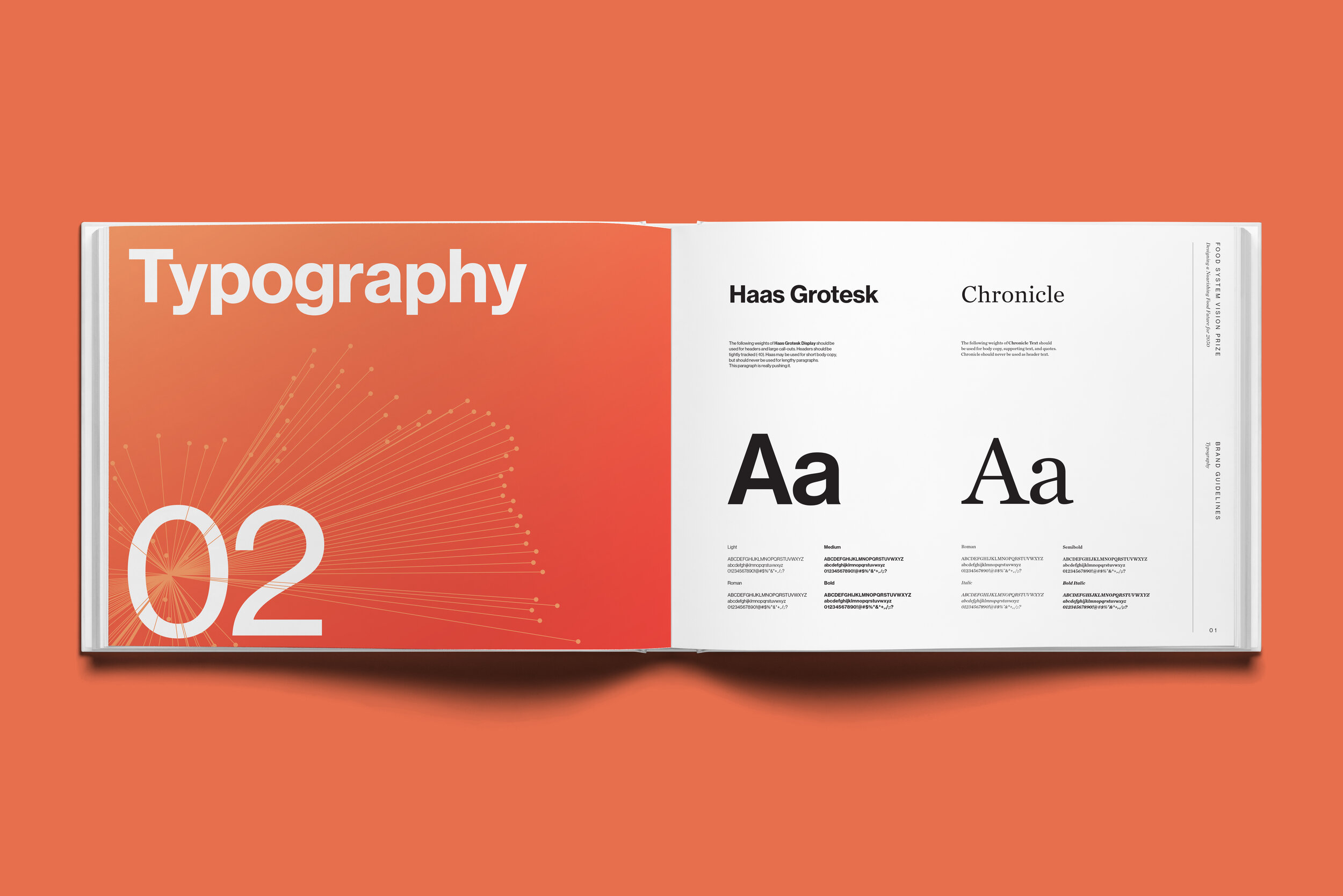
Simple, bold, clear typography


The logo mark is marriage of the tech-ture style with an abstract landscape

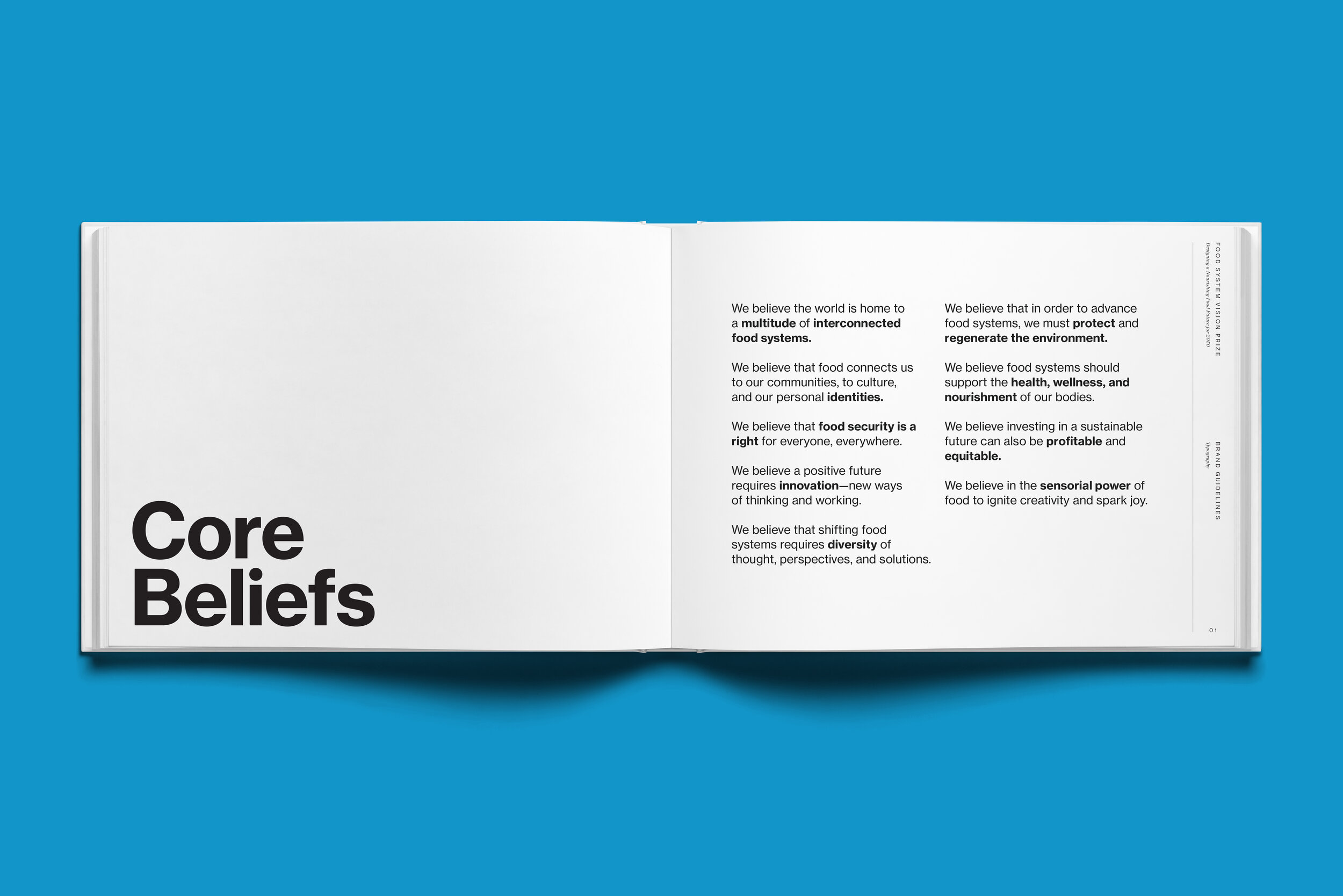
Structure allows for easy reading and navigation

Photography focuses on humanity and diverse cultures with a connection to nourished, healthy, happy individuals and communities

Photography also celebrates nature, a connection to land, nurturing the environment, and the joyful, sensorial nature of food
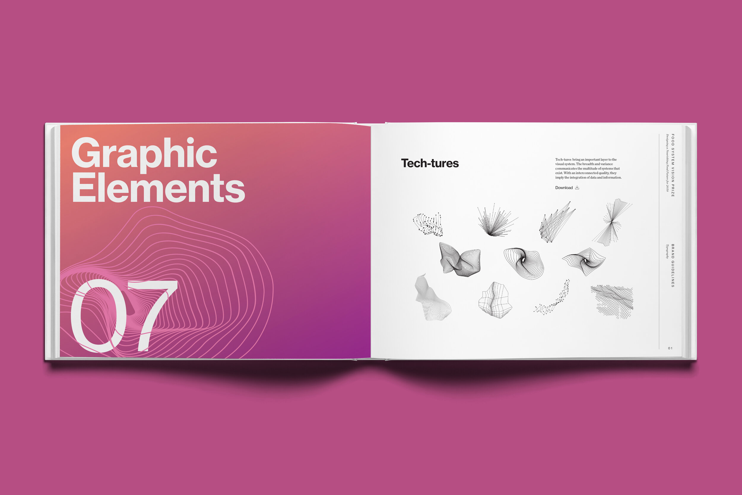
Tech-inspired textures convey systems complexity, innovation with an eye toward data; the flexible system of tech-tures symbolizes the diversity and multitude of systems
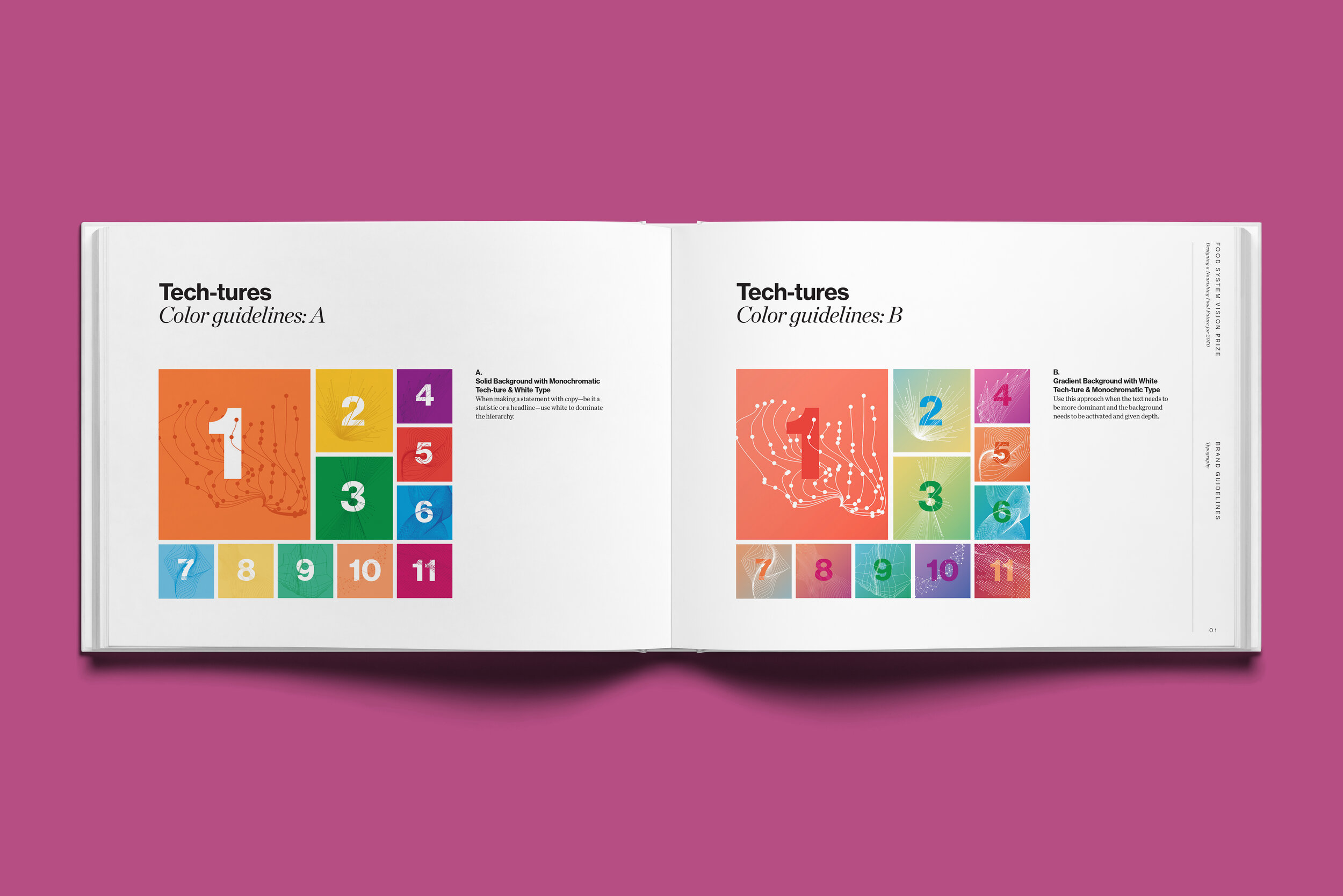
Typography visually integrates with tech-textures — overlapping and interplaying with each other, creating depth and reinforcing interconnected quality


Examples of the design language where photographic, typographic, and line design elements weave in and out through each other – creating a sense of depth and interconnectedness.